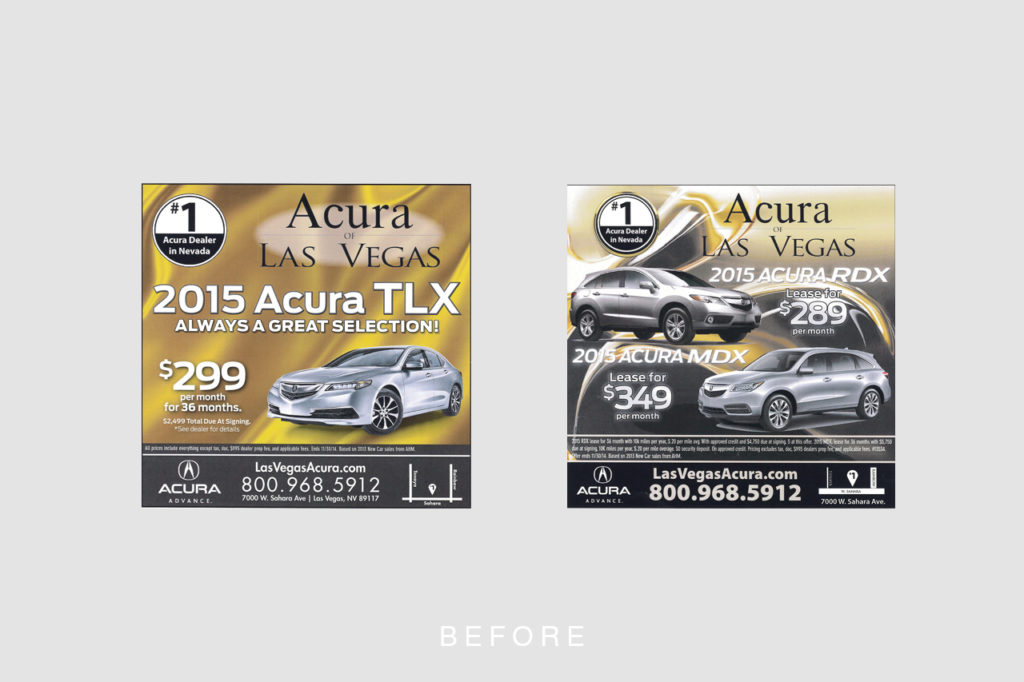
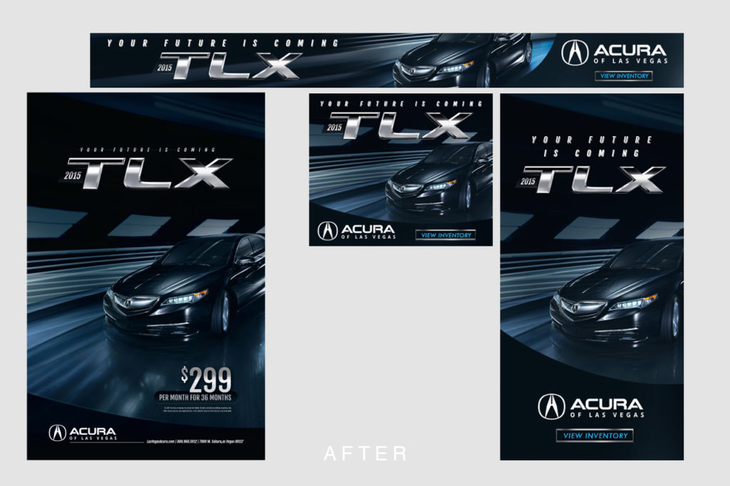
Rebrand
Best viewed on a desktop.
I’ve included the previous look on the left and the refreshed look on the right.
Product Launches
A mixed sample of product design.
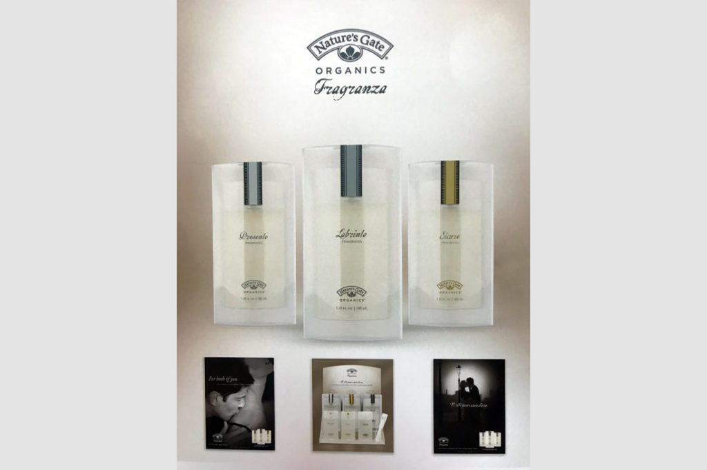
An all natural perfume line that I designed a suspended bottle case for in addition to the launch collateral. Those glass bottles are floating seemingly in mid-air in the container. Truly one of the most fun I’ve had making POS deliverables.
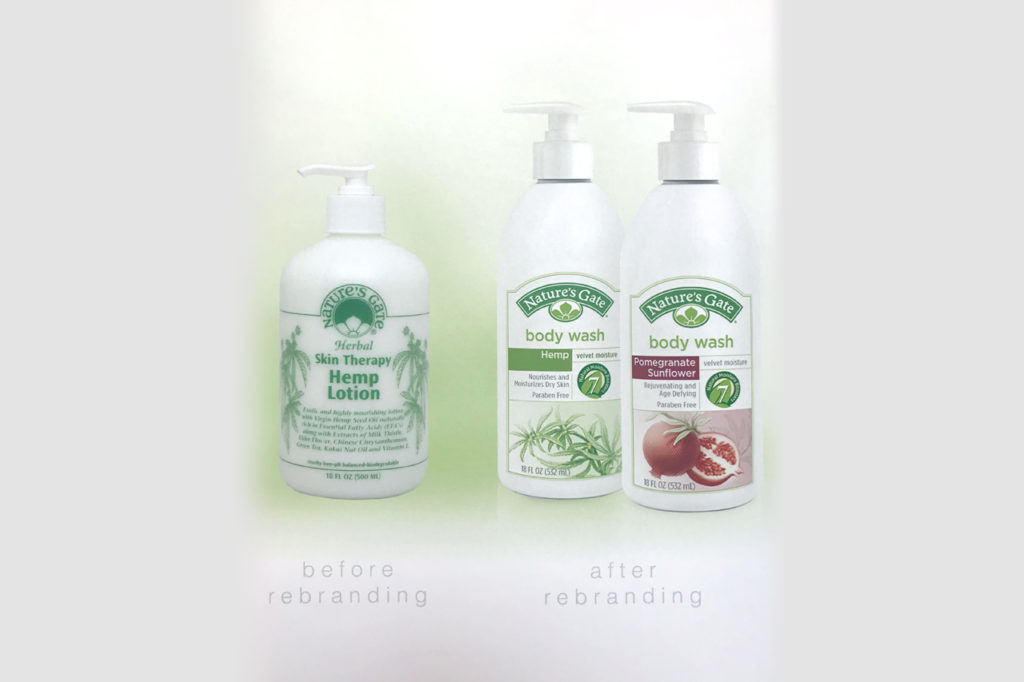
Natures Gate has been around since the early 1970s… and looked it. Well, at least till I came along and redesigned the entire line. Something like 125 skus. This shows rebranding of the core look that carried over to all sell sheets, product displays, ads, etc. All those botanicals are hand drawn and tinted.
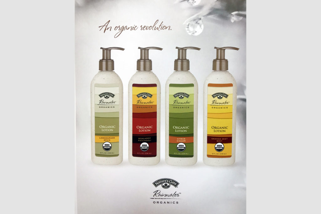
This was my first truly cradle-to-cradle product design that was truly 100% repurposeable. Not just “recyclable” or “natural”, this product line was a trailblazer in sustainability… The bottles were made from ground up CD cases, the labels were the first soy-ink printed labels on the west coast, and all the point of sale displays and collateral were printed using wind-powered crafted paper. All innovations that were unheard of at the time, which have now become thankfully more commonplace. This kind of work was why I sought out natural products back then, and it’s an honor to have helped influence the industry to shift their practices for the betterment of the environment we all share.
Trivia: The label design was even stolen by a huge Japanese Tea company for their loose leaf tea containers.
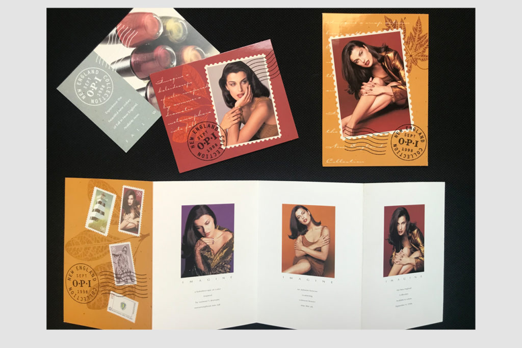
At OPI, I did three collections of nail lacquer a year. Announcing each of those collections were brochures and salon mail teasers. This is an overview of how i’d “tease” a collection to spur interest in the launch. All items are designed for the most effective mailing and bulk rates of the day.
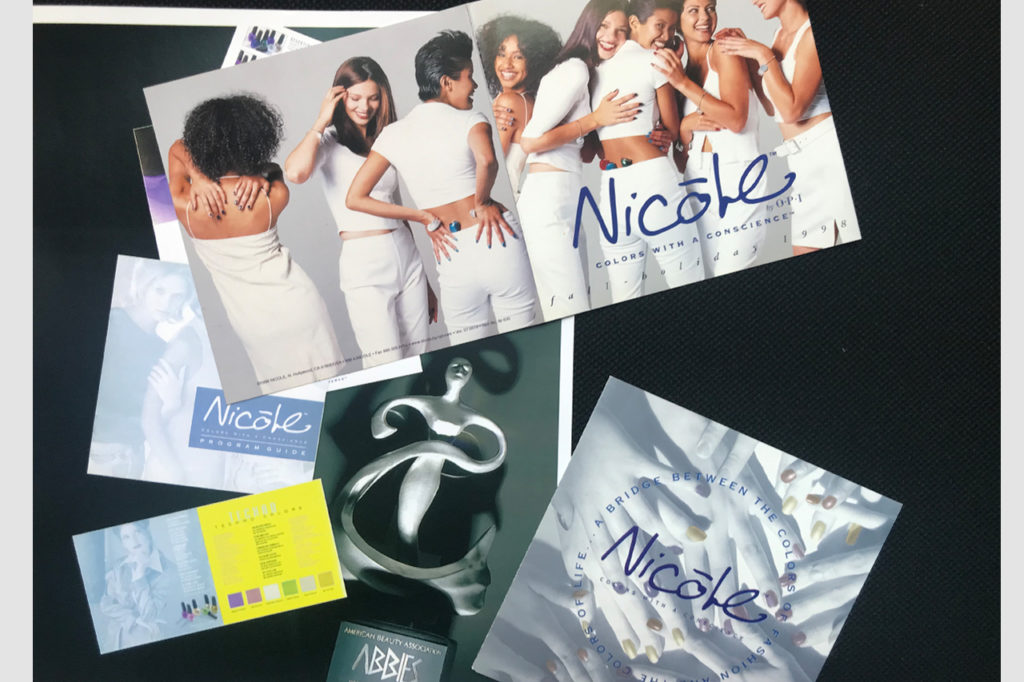
The Nicole by OPI line launch won an Abby that year. Its hard to see in this photo, but the collateral brochures were printed in metallic blue ink. It was eye-catching and highly reflective, and I chose the color to best stand out in retail store fluorescent lighting against the competition.